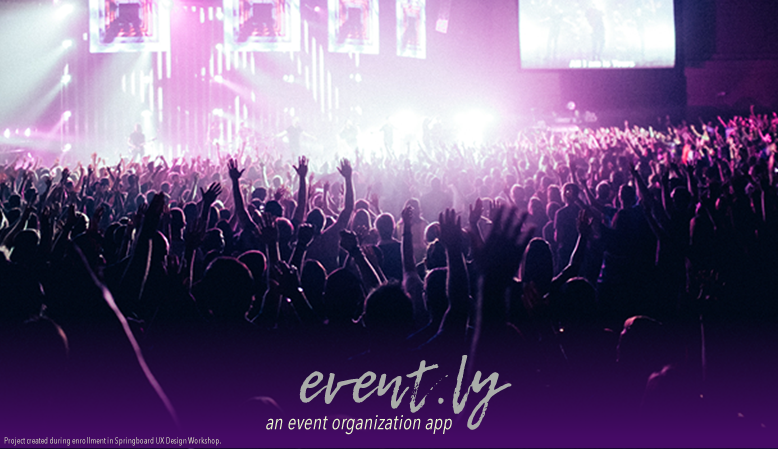
From August to November of 2017, I worked on a project through Springboard, an online certification course for UX Design, in order to brush up on my design skills. The course focuses on a three-month long project focusing on user-centered, data-driven design. For my project, I have chosen to design a hypothetical service that allows users to plan and advertise events across multiple social media platforms. I was inspired to create this service from my own frustrations with planning events and inviting guests using social media because I have friends who use multiple different social media accounts and friends who don't use social media at all, and I had no way of easily inviting everyone, organizing what materials were needed and who would bring them, and keeping my to-do lists all together in one place.
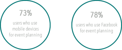
My first step in creating this service was to gather some information on how desirable the service actually is and what features were most desired in such a service. I sent out a survey across my social media networks and gathered some responses to determine the answers to my questions.
After gathering this data, I created two personas and empathy maps to give a more personal look into what individual users of the service might look like. I based these off of individuals who answered my survey and let me ask them a few more in-depth questions about why they would want such a service and how they would use it.
Take a look at my two hypothetical users, Social Media Mogul Sean and Wedding Planner Wendy.

Once I had an idea of what my users would want and their motivations for using the service, I went and looked at some potential competitors. However, I didn't want to look at the existing sites as my enemies and just tear them apart. While looking at my top three competitors, I wanted to see what they were doing well and how I could improve on the process for users. Following the Nielson-Norman heuristics for user experience,I was able to come up with a short analysis of the sites, looking at the criteria I found most relevant to my project.
Read that heuristic analysis here.
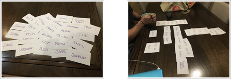
Once I had looked at the competition for my idea and judged their sites, I moved on to conducting card sorts to help guide the creation of my own app. The card sort for this project was conducted with three users who filled out the initial survey and best exemplified the personas that were created to guide the creation of the app.
The terms included in the sort dealt with task flows as well as categorization of where those tasks should be. Participants were encouraged to look over all of the cards before beginning the sort. Each participant used all of the terms provided in their card sorts, though one stated verbally that there were some terms that they would hesitate to include even though they were able to group them with other terms of similar categories.
Generally, participants independently agreed which cards belonged in certain categories. Each participant was able to identify a card that best exemplified what page a set of tasks should fall under (e.g., “Location”, “Time”, and “Date” all got sorted under “Event”, which participants categorized under a “Create” card).
I also made user flows for five tasks to further guide the design of the app.
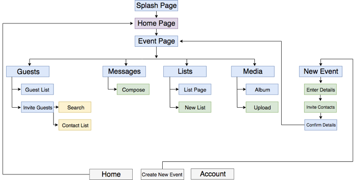
With the combination of the information gathered from the card sorts and the roadmap I created for myself from the user flows, I came up with a site map to show how each page and navigational element in the app connected to each other and to provide a further roadmap in creating wireframes.
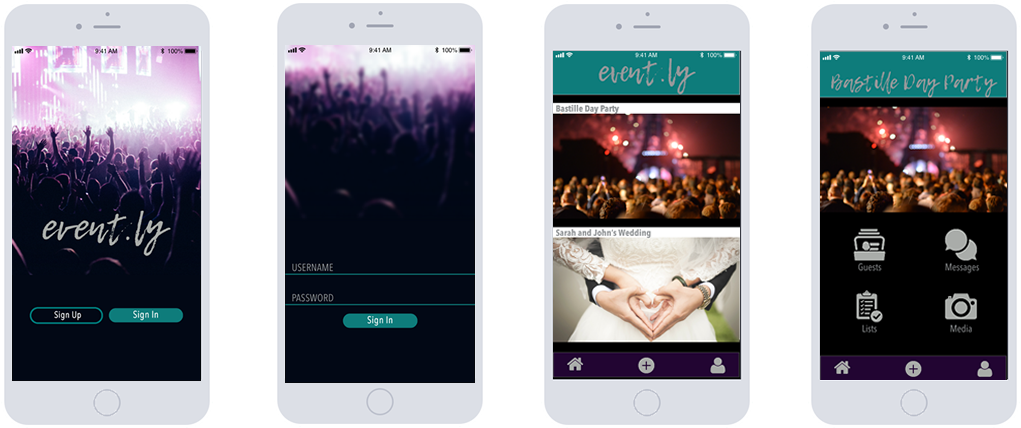
Once I knew how I wanted the app to flow, I created wireframes using Balsamiq Mockups.
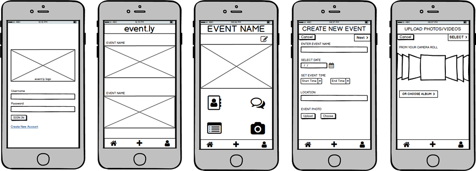
I also made those wireframes interactive for usability testing. You can download and complete the five tasks that were presented in the user flows with them here.
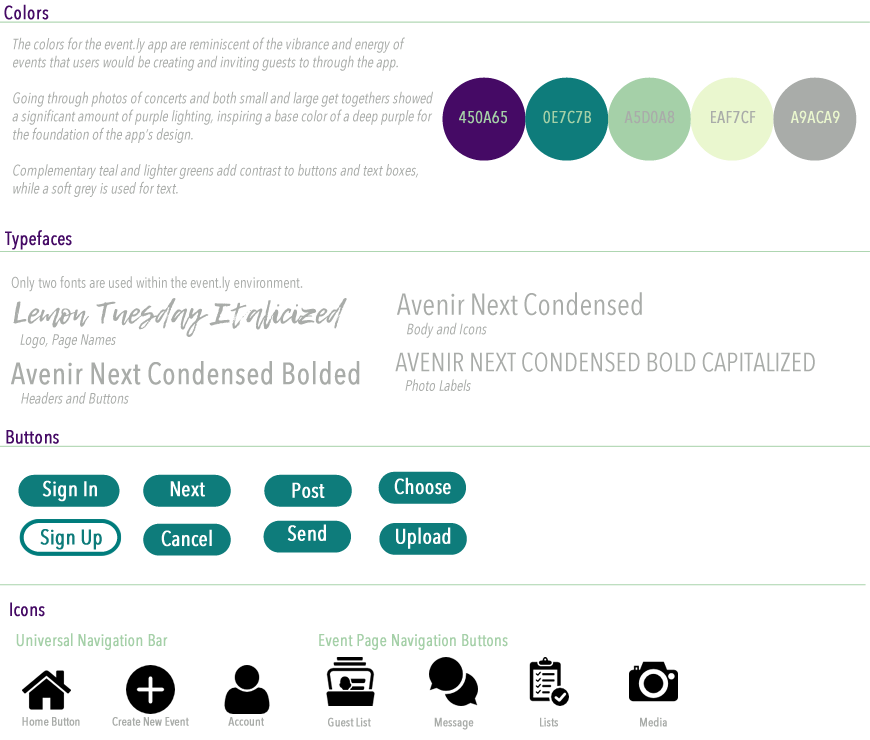
I took a slight detour at this point to work on a style guide for the app to help me more easily conceptualize how the app would look as a final product and to show the participants in the usability testing what they could imagine while interacting with the wireframes.
Once I had some visuals to show participants to help them get an idea of what the app would look like, I began usability testing.
Testing with four participants showed that users find the current design of the app very easy and intuitive to use, with very few pieces of feedback given to “fix” anything. Some of that feedback stemmed from the limitations of the user scenarios built for the prototype. Users also wanted labels on navigation buttons instead of just buttons.
Three of the four participants were of the Social Media Sean persona type, and one was a variation of the Wedding Planner Wendy persona. Two were female, one was male, and one identified as a non-binary gender. All were within the age range of 24-35 and work in technology retail, with educational backgrounds in liberal arts.
With the information and feedback gathered from this testing, I will plan on changing some of the navigation icons and adding text to other menu buttons in a more high-fidelity prototype to further clarify the function of those buttons. With the addition of more functionality, users will also get more clarification on being able to share lists and albums with event guests through the app.